Imagine you’re a manufacturer in the food industry. You monitor products closely, yet you still identify quality issues. No matter how small, fixing problems with limited resources and in a timely manner can be quite challenging. Especially if you see multiple opportunities for quality and process improvement. This is where the Pareto chart comes in – a visual approach to analyzing an impactful problem, gaining insight into its frequency, and identifying solutions. How can you integrate the Pareto chart into your workflows and how does it work if you’re using quality management software? That’s what this article is about.
Quality improvement based on the Pareto principle
Before looking at use cases and interpretation, it’s worth noting that the Pareto chart is based on the Pareto principle. Developed by engineer and economist Vilfredo Pareto, the Pareto principle highlights uneven distribution and is also known as the 80/20 rule. This because it states that 80% of the results are determined by 20% of the causes.
Translated into the context of production, the Pareto principle can be identified in a number of different scenarios. For example:
- 80% of the outcome is controlled by 20% of the inputs that contribute to that outcome
- 80% of a business’ revenue could come from 20% of its products
- Or, dialing this principle further down into Quality Control, 80% of deviations come from 20% of root causes
In application, the Pareto principle is leveraged in Quality Management via the chart with the same name.
The Pareto chart: a simple, understandable visual
The Pareto chart helps teams visualize the aspects of a problem and orders them from the most to the least impactful. This helps manufacturers to prioritize follow-up actions and find the quick road to improvement. Let’s illustrate how the Pareto chart works and how it should be interpreted with an example.
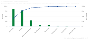
Remember the food manufacturer at the beginning of this article? Let’s imagine that when manufacturing pickles, they identified eight inconsistencies with their product: softness, bitterness, hollow pickles, shriveling, discoloration, dark pickles, spotted pickles, and white sediment in the jar.
On a Pareto chart, these eight defects would appear on the X-axis. The Y-axis would state the frequency for each inconsistency and order them from the most to the least frequent. So, from the example below, we can see that bitterness and softness are the highest bars, whereas spotted pickles and dark pickles are the shortest. Prioritizing the largest bars, the defects that occur most often will help with overall improvement more than focusing efforts on the shorter bars.

The Z-axis, to the right, represents the cumulative percentage or the percentage of defects that can be removed if the most frequent types of defects are resolved. A steep line in your cumulative percentages indicates causes that have a more significant impact. Let’s go back to our example. According to the Pareto principle, if we focused our efforts on resolving the defects around bitterness and softness, we will see the biggest improvement in the quality of our pickles.
Pareto charts – main use cases
As mentioned above, a Pareto chart is an impactful tool that Quality mangers and staff can leverage at both macro and micro levels to gain insights and streamline production.
A Pareto chart can be used to:
- Run an analysis on broader causes by breaking them down into individual factors
- Zero a team in on more significant problems when there are too many issues at play
- Visualize the significance of a cause so that a team has a better understanding of it
- Gain insight for prioritization
How to create a Pareto chart
Creating a Pareto chart is a multistep process. It usually involves steps like identifying a purpose, defining tools for measurement, establishing a timeframe, collecting, and analyzing data before the actual building for the chart. In a smart QMS system like AlisQI, however, Pareto charts are available for all selection list fields. This means that you have immediate access to data and the Pareto principle is just a click away.
More specifically, click on the column header of the selection list of interest and open the distribution panel. This will allow you to analyze your data using Pie and Pareto charts.


You can see how a Pareto chart can be highly useful in optimizing your QC/QM efforts. To learn more about how a tool such as AlisQI can act in support of Pareto charts and many other QM techniques, request a demo today.


