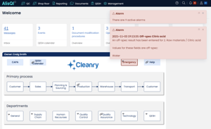
From catchy screen colors and fonts to improved ease of use on handheld devices, and an experience that’s overall more pleasant, AlisQI users can now enjoy the app’s new design. We are proud to celebrate this important achievement and have our Front-end developers Pauline and Vincenzo talk about the project.

Why did we decide to redesign our app and what were the ‘must-haves’?
Pauline: We wanted to make the application feel more modern and set up a new standard in our industry. With the classic design, pages worked really well, but it all looked a bit old – the color palette and design elements were outdated. So, we decided to refresh them. We focused on improving the user interface (UI) because the user experience (UX), the interactivity of the application, was already well thought out.
Vincenzo: I see AlisQI as being a very flexible, adaptable tool. And one of the main goals was to reflect that flexibility in the interface itself. We want users to experience the app their way, just like they can adapt the way the application works to their use cases. They should experience AlisQI in a way that is comfortable for them and also compliant with their needs – this means making the app work on more diverse screen sizes, more diverse input methods.
What were some of the challenges?
Pauline: Even though the redesign means an app that is more modern, we know that (in general) users are reluctant to change. In our industry, we have users who are just logging into the platform because they want to check or change some data, or quickly perform a task. They don’t want to see anything different but use the application in a way that doesn’t require them to readapt. Therefore, we needed to introduce the redesign in a way that isn’t frustrating, intrusive, or has users confused.
This is also why we decided to implement the redesign in phases – including an opt-in/opt-out phase. We introduced changes incrementally and allowed users to understand what’s different, instead of having to adapt on the go. I think our approach really emphasized our empathy and understanding of the users.
Of course, there are still users who immediately switched back to the classic design and will probably use this until the day when we get rid of the old design altogether. But still, allowing this time and this phasing of the project worked really well for us.
Vincenzo: Indeed, we chose a deployment strategy (the opt-in followed by an opt-out phase) that tries to minimize the impact of our changes. On a practical level, that means that we’ve been supporting two versions of the application – the classic design and the new design. This is as if you were a tailor trying to make the same jacket fit two different people. You see things that you might want to improve right away but you need to hold off, understand and wait until you can do so without having to do that work twice.
It was a fun challenge to tackle but at the same time, we were getting excited by all the improvements that we wanted to bring to the table and had to postpone for a while. Also, getting feedback from our users and trying to make that fit into our project, has sometimes been difficult. But it’s taught us a lot.
What about feedback? How did AlisQI users receive the redesigned product?
Pauline: When we gave users the possibility to try out the redesign, we saw the opt-in phase really shine. We had a couple of power users, early adopters who immediately switched to the new redesign and sent messages about what worked and what didn’t work so well already back in September. And this was the moment when I really started noticing users who are so involved and care so much about the product. This felt really good because it means that they are leveraging AlisQI. All the communication, the feedback on what works and what could be improved is incredibly useful.
Vincenzo: Luckily, we have users who provide us feedback. I really want our users to feel free to tell us where the issues are, we want to help, to fix things, and we want to make the application more accessible for everybody.
Were there cases in which customers worked alongside you?
Pauline: Yes, a good example of this was the feedback we received on accessibility. We received a call from a customer who is colorblind telling us what features didn’t work for them. After this, we had daily contact and shared screenshots to ensure that we were headed in the right direction – it was very interactive. Because we were still in the opt-in phase, we were able to immediately address their concerns and implement changes quickly.
Vincenzo: I would say just in general; our users have been instrumental in making sure everything went smoothly. If there were small visual parts and stuff that wasn’t displayed properly, they let us know and we have a system in place and we can address that fairly quickly. Due to this system, we can act and make sure that our users have the best experience possible.
How was the collaboration within the team?
Vincenzo: As soon as I joined the team, I felt included, and I was immediately capable of bringing value to the team. I think that really speaks volumes, it speaks of the quality of our teamwork, it’s a better endorsement than any feeling I might have. There is tangible proof of how much of a well-oiled machine we are.
Pauline: The redesign project started with me working with an external designer. We quickly noticed that it was a big project, so we hired Vincenzo, who started as an intern. Immediately, we noticed that he’s really great and it was perfect as we needed someone to work full-time on this project.
One of the great things about AlisQI is that there’s no hierarchy, everyone can share opinions easily. Even for me when I started, though I felt very much like the newbie, I was still able to share feedback and speak freely about what needed improvement. This is possible to do in our team and it’s something that feels really good. When Vincenzo joined, for me it was really important to never say ‘oh he’s just an intern, so let him do some repetitive task in redesign.’ No, let’s also give him some screens to prototype and his own responsibilities. I think this is how you learn and for us, it was also very important to speak on eye level within the team and with management.
Anything else that you want to add?
Vincenzo: We already touched upon it, but I want to underline that all feedback is good feedback. Just because things work, it doesn’t mean they cannot be improved. So, if any of our users feel like something can be improved, we are always listening. Just because some feedback has not been implemented right away, it doesn’t mean it has been ignored. It just means that we need to fit it into our priorities.
Pauline: Even though we say that the redesign project has come to an end, it’s not really the end. We will continue to improve the application. We want it to be modern and at the top of technology when it comes to styling and design. Now we have a team of front-end developers on board, and we can focus on continuously improving and that comes with feedback. Thanks to everyone who helped us, your feedback is gold.
Test the new UI yourself and book a free online demo in which we’ll show you how AlisQI makes your quality management smart and omnipresent.


